
Tuesday, 15 December 2015
Action plan for my music magazine
Today I reviewed my music magazine with my teacher and went over some point that I can improve on like layout on my front cover and fonts on my DPS, because some of the fonts were the different and it wasn't really a good piece. I have to sort out cover lines and sizing and layers because I did the cover lines in one layer it was hard to move and manipulate so I have to change it so its separate layers so I can improve it. I have a game on my DPS and I was told that it was very random so I am planning to put a box around it so it sort of placed on my double page spread.

Friday, 11 December 2015
Evaluation Planning - proposal
This is my evaluation plan saying what technologies I will putting each question on this was a reminder for me because it let me know what question I was doing it on because at times I would forget. here it explains what I chose for the technologies explaining why I chose it I tried to have a varied options of technologies to get the highest possible marks for the evaluation. I made this on prezi this also taught me how to use prezi and add pictures to it showing the technologies to the reader.
Monday, 7 December 2015
Front Cover so far...

This is my semi final front cover it still has some improvements that I can do to it so that is why I will be doing this on the 6th of January just putting some finishing touches on the front cover, I need to change some of the cover lines so that they are some bigger than the other so it shows more features of a music magazines also some of the cover lines are not aligned and it looks messy so I really do need to change that so there are small improvements that I still need to do but it is looking good so far I really like the colour scheme that I used its making good progress.
Friday, 4 December 2015
Contents Page and Double Page Spread so far...


Here is the semi final contents page and the double page spread it is finished but I still need to put little bits in like boarders and make sure that the columns of the DPS is equal. The contents page text is not in a straight line so I really do need to fix it because it just looks messy and that is the type of feedback I got from that as well.
Monday, 30 November 2015
Audience feedback of my magazine in progress.
Here is the audience feedback I got from my music magazine, people in my class commented on my front cover, contents page and double page spread. There was a lot good feedback about the masthead and the colour scheme as well but there was negative comments about the images that it looks stretched and not right so I need to fix that, and because my double page spread was not finished at the time they gave me feedback based on the images and they said that it was good progress.
CLICK THE WORD 'HERE' TO BE TAKEN TO THE MEDIA
CLICK THE WORD 'HERE' TO BE TAKEN TO THE MEDIA
Friday, 27 November 2015
My front cover, double page spread and contents page.

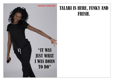
Here is the front cover, double page spread and contents page its not exactly finished especially the double page spread I need to add the text to the double page spread and I am currently typing it up on word to make sure that there is no grammar mistakes and everything is good before I put it on InDesign. I have an idea of what I'm going to do for that I'm thinking of doing a Q&A asking her questions about her music career and make sure the fans get to know her more.


Thursday, 26 November 2015
Work in progress contents page.

Here is the contents page work in progress so far I am adding fonts and pictures, I am happy with this so far and its looking really good and next lesson I'm planning to add more images and more pieces to the contents page like more names. I have started the subscription box that will be at the bottom on the right side. The contents page is on InDesign and I'm not used to that so I'm a little bit struggling with text boxes and images but I'm getting used to It and the contents page is going very well this will help me with the double page spread. I have changed the images and the cover story because I thought that the images I took with one model was not good enough and I deleted the guitar that was behind the title because I thought it was a bit to much and looked better with out it.
Subscribe to:
Posts (Atom)