Here is the audience feedback I got from my music magazine, people in my class commented on my front cover, contents page and double page spread. There was a lot good feedback about the masthead and the colour scheme as well but there was negative comments about the images that it looks stretched and not right so I need to fix that, and because my double page spread was not finished at the time they gave me feedback based on the images and they said that it was good progress.
CLICK THE WORD 'HERE' TO BE TAKEN TO THE MEDIA
Monday, 30 November 2015

Friday, 27 November 2015
My front cover, double page spread and contents page.

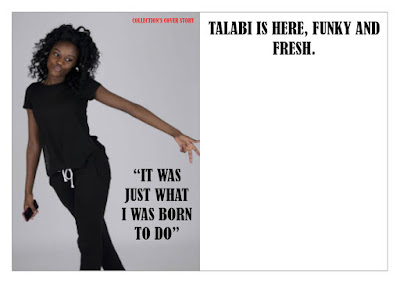
Here is the front cover, double page spread and contents page its not exactly finished especially the double page spread I need to add the text to the double page spread and I am currently typing it up on word to make sure that there is no grammar mistakes and everything is good before I put it on InDesign. I have an idea of what I'm going to do for that I'm thinking of doing a Q&A asking her questions about her music career and make sure the fans get to know her more.


Thursday, 26 November 2015
Work in progress contents page.

Here is the contents page work in progress so far I am adding fonts and pictures, I am happy with this so far and its looking really good and next lesson I'm planning to add more images and more pieces to the contents page like more names. I have started the subscription box that will be at the bottom on the right side. The contents page is on InDesign and I'm not used to that so I'm a little bit struggling with text boxes and images but I'm getting used to It and the contents page is going very well this will help me with the double page spread. I have changed the images and the cover story because I thought that the images I took with one model was not good enough and I deleted the guitar that was behind the title because I thought it was a bit to much and looked better with out it.
Monday, 23 November 2015
Work in progress : Front Cover

Today I started to work on my front cover adding the main cover line and adding a puff on it showing the page number of that article. I am still figuring out the colour scheme I might just keep it as grey and white and just stick with two colours, I still have more cover lines to add and I will add this next lesson using different layers to move the cover lines a bit better maybe make some bigger than the other so it have more focus points.
Tuesday, 17 November 2015
Contents page in progress

I started to make progress on my contents page adding images and text as well also added page numbers so that the reader has an easy access to the pages and so that there not flicking through. I got a location shot on brick lane for my collection's review bit of the magazine which will involve things like concerts articles and feedback on artist what they have got up into the month I chose this image because it is rocky and edgy and I added it to the contents page today overall it has been a pretty decent lesson and I made a lot of progress on the contents page. I'm not sure about the guitar behind the contents page title and might look at it in more detail next lesson.
Monday, 16 November 2015
Front cover in construction

Friday, 13 November 2015
My contents page (In progress)

In today's lesson I started to layout my contents page to see where all the pictures and text was going to go. I also added the masthead as well just to see what it would look like on the contents page and I like it a lot especially with the guitar in the background give it a edgy and rocky effect to it and that is exactly what I wanted and going for. The bigger the boxes the bigger the article I decided that the biggest box will be the cover story so it stands out and speaks to the reader almost and that is the first thing they see but I have also made my collection's review box bigger so that stands out to the reader as well.
Subscribe to:
Posts (Atom)